
Maple Creates A Feast For The Eyes & Stomach
Few restaurants understand the importance of design and delivery quite as well as Maple.
That's because Maple may not be a restaurant, at least in the traditional sense. They operate out of private commercial kitchens and only fill orders that customers request directly from the Maple mobile/web app. The unusual decision has allowed them to exclusively focus on a visually appetizing digital experience and superior delivery order service.
Their approach seems to have paid off. Approaching ten months after their launch, Maple has been cycling past food-delivery competition in New York City. We find ourselves tempted from their delicious photographs, excellent UI, and quick ordering process.
“Restaurants aren’t set up to do delivery well. They don’t have the budget or time to think about packaging or putting technology together to route the orders intelligently,” co-founder Caleb Merkl told WIRED in an article last year. “For us, everything we do is about how to make some part of delivery better.” It was started by Merkl and co-founder Akshay Navle, but the big draw for initial press and some customers has also been the oversight and backing (financially, verbally) from legendary chef David Chang.

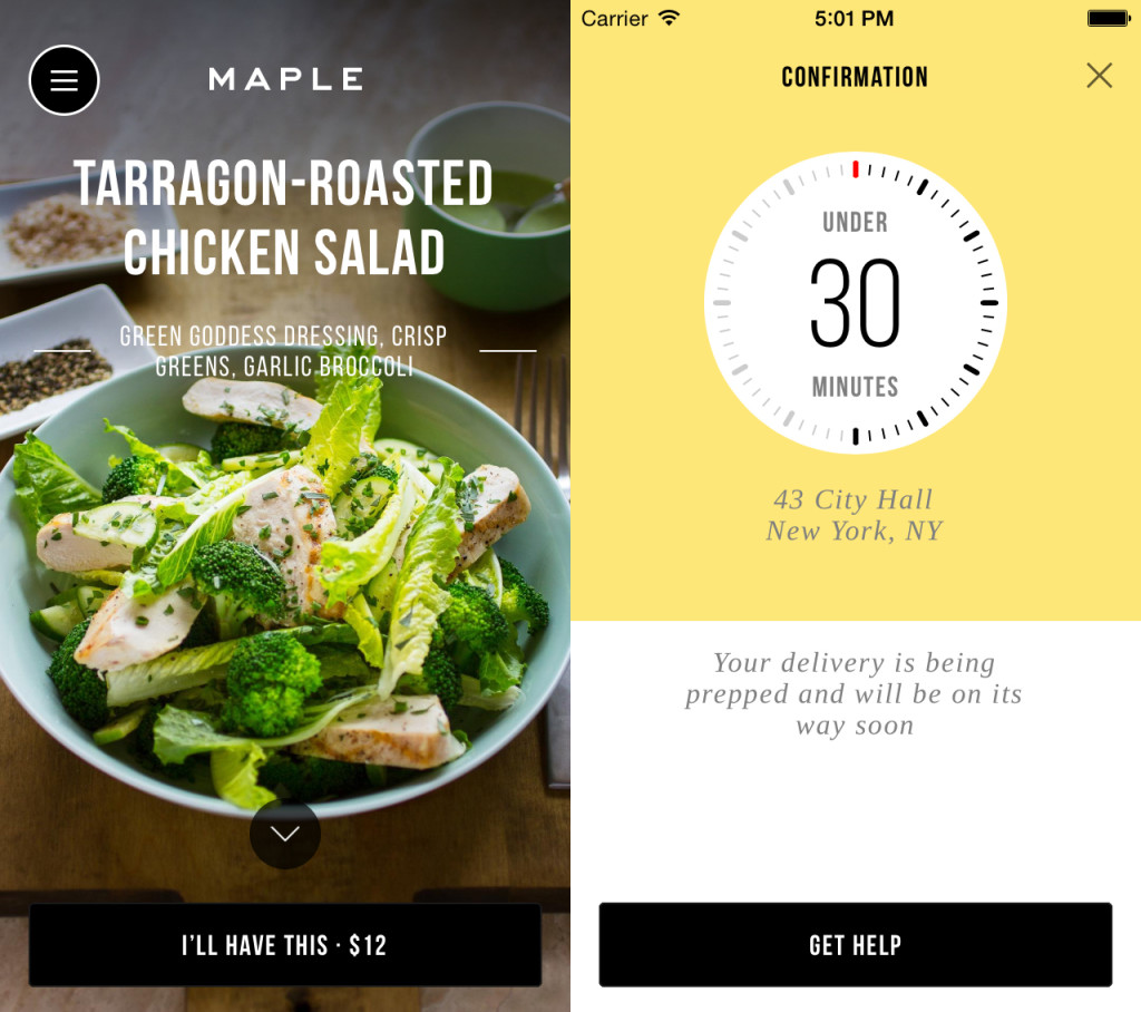
A display of ingredients from each dish are presented like this for every option.
The visual brand identity for Maple is minimalist, and still impactful. Their physical packaging has a bold yellow color system with the brown-shades of bags and containers. The color palette has become a recognizable trademark.
Yelllow was a rebellious answer to the usual all-green approach that so many food entities use to show how fresh their ingredients are. Merkl told The Fast Company that yellow "conveys a tastiness, a comfort, and also isn’t used by many people. If this business is successful, it’s important to be distinct."
Not only is the packaging just pleasing to the eye, but it physically was also tested through conditions such as heat, rain, and amount of proper container space to keep the food from moving too much. The branding was done by a former assistant creative director of MOMA.

There's no reason why all restaurants shouldn't be putting this much effort into their identity, packaging, and customer experience setup. In an interview with The Fast Company last year, Chang made a remark that sums it up pretty well: "If I got this for delivery, I’d be like, 'Holy fuck!'"
We second that sentiment, and say "Keep it coming."
Photos thanks to Maple.